
Gouache is watercolor's opaque sibling — same gum arabic binder, same paper support, but with enough pigment density to cover what's underneath entirely. This covering power is gouache's superpower: you can paint dark over light, correct mistakes completely, and build up graphic color fields with a richness and opacity that watercolor cannot achieve. The result is the characteristic chalky matte finish that makes gouache illustrations immediately recognizable — whether in vintage travel poster art, contemporary flat illustration, or editorial children's book work.
Ready to start? Jump to the 5 complete templates below, or try one of these instant copy-paste prompts right now. For other painting techniques, see our watercolor prompts guide and oil painting prompts guide.
5 Quick-Start Gouache Prompts (Copy & Paste Now)
Use these immediately — no setup required:
Botanical Still Life
Gouache painting of [peonies and eucalyptus / wildflowers / tropical leaves] in a
ceramic vase on a cream background. Technique: opaque flat gouache layers —
matte chalky finish, no transparency. Brushwork: confident flat marks visible
throughout. Highlights: pure titanium white gouache applied last. Style:
contemporary botanical illustration — flat graphic quality. No watercolor washes,
no digital gradients — pure opaque matte gouache pigment.
Urban Poster Scene
Gouache painting of [a Parisian street / Tokyo laneway / Mediterranean harbor]
in a bold mid-century travel poster style. Technique: flat opaque color planes,
graphic simplified shadows. Palette: [warm ochres and teals / vivid complementary
colors]. No gradients, no watercolor transparency — pure graphic gouache poster quality.
Graphic Portrait
Gouache portrait of [subject description]. Style: contemporary flat graphic
illustration — simplified color planes, not photorealistic. Skin: warm flat tones
with color stepping (not gradients). Features: simplified graphic shapes.
Background: flat opaque [cream / navy / sage]. Technique: opaque layers,
highlights applied last as pure white marks. Matte chalky gouache finish.
Fantasy Character
Gouache fantasy illustration of [a forest spirit / sea witch / fire mage] in
[misty woodland / underwater kingdom]. Glow effects: warm opaque marks painted
over dark base layers. Color scheme: [deep greens and midnight blue / jewel tones
with golden light]. Style: fantasy book cover gouache illustration — rich colors,
graphic depth. No transparent layers — pure gouache opacity.
Abstract Color Study
Abstract gouache painting exploring [coral and cobalt blue / warm sunset tones /
cool Nordic palette]. Composition: overlapping geometric shapes with organic edges.
Technique: thick opaque color planes layered over each other — gouache's reworkability
exploited. White used as a graphic element. Matte chalky finish throughout.
What Makes Gouache Unique
Understanding what physically distinguishes gouache from other paint media will make your prompts far more specific and effective.
Gouache vs. Watercolor
The difference is almost entirely about opacity:
| Quality | Watercolor | Gouache |
|---|---|---|
| Opacity | Transparent | Fully opaque |
| Highlights | Preserved white paper | Titanium white paint added last |
| Layering | Light to dark only | Works both ways — dark over light |
| Finish | Luminous, slightly shiny | Matte, chalky |
| Corrections | Difficult | Relatively easy — paint over |
In prompts: Watercolor asks for "preserved white paper, transparent washes, wet-on-wet blooms." Gouache asks for "opaque flat pigment, matte finish, titanium white applied last."
Gouache vs. Acrylic
Gouache stays water-soluble when dry (you can re-wet and rework earlier layers). Acrylics become water-resistant. Gouache is also consistently matte — acrylics can be gloss or matte. For AI prompts, gouache's matte chalky surface is the visual tell.
The Flat Graphic Quality
Unlike oil paint (thick impasto, expressive impasto marks) or watercolor (translucent washes), gouache naturally produces flat, opaque color fields — which is why it became the medium of choice for commercial illustration, poster art, and graphic design work throughout the 20th century. When prompting for gouache, lean into this graphic flatness: "flat opaque color planes," "bold simplified shapes," "graphic shadows."
5 Gouache Prompt Templates
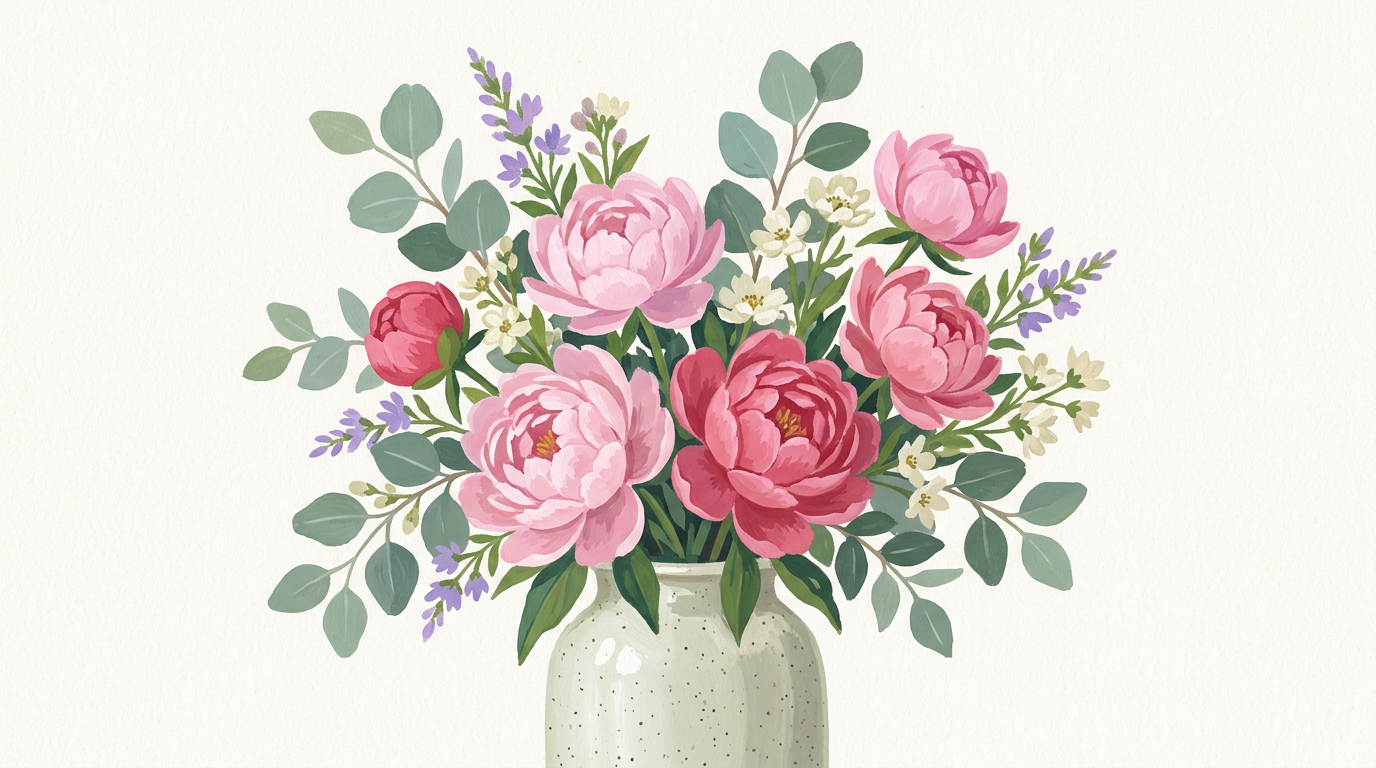
1. Botanical Still Life in Gouache
A [peonies and eucalyptus in a ceramic vase] painted in traditional gouache
illustration style. Arrangement: [loose abundant bouquet] on a [warm cream]
background. Color palette: [soft pinks, deep rose, dusty sage green, and
cream white]. Technique: opaque flat gouache layers, no transparency —
medium's defining matte chalky finish. Brushwork: confident flat brush marks
visible throughout — individual strokes legible in petal and leaf edges.
Leaves: darker mixes painted around lighter shapes, pigment applied undiluted.
Highlights: titanium white gouache applied last as pure opaque marks. Style:
contemporary botanical gouache illustration — flat graphic quality, not
photorealistic. No watercolor transparency, no digital gradients — pure
opaque matte gouache pigment.
Variables to customize:
- Subject:
wildflower bouquet/tropical leaves with orchids/autumnal dahlias and berries - Background:
deep navy/soft sage green/terracotta - Palette:
deep jewel tones/warm autumnal oranges and reds/monochromatic greens
Why this works: Specifying "individual strokes legible in petal edges" and "darker mixes painted around lighter shapes" mirrors the actual technical process of gouache botanical illustration — painting the background color into the flower silhouette rather than painting the flower onto a white ground.
2. Urban Landscape — Poster Style
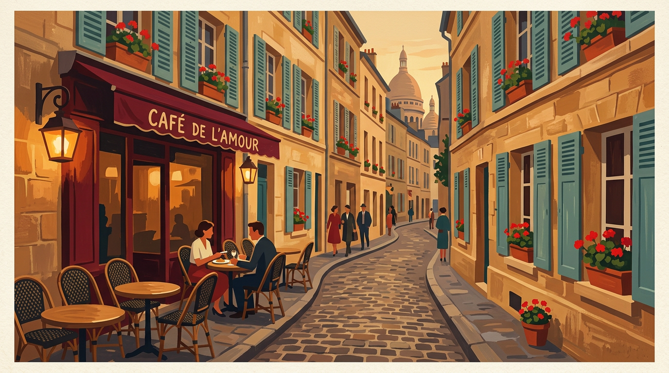
A gouache painting of [a Parisian cobblestone street with a café terrace and
geraniums] in a bold graphic poster style. Viewpoint: [street-level perspective
looking down the lane]. Lighting: [warm golden evening light raking across
stone facades] — strong shadows simplified into flat shapes, no gradients.
Buildings and surfaces: flat opaque color planes — gouache's natural affinity
for graphic simplification. Color temperature: [warm ochre stone, teal shutters,
dusty terracotta rooftops, amber light]. People: [a couple seated at a café
table, one figure walking away] — simplified silhouettes, not detailed. Sky:
flat warm amber — simple color, not descriptive. Shadows: single flat tone,
painted as graphic shapes. Style: mid-century travel poster gouache quality —
graphic, immediate, decorative. Medium: dry, matte, opaque — no watercolor
washes, no transparency, no digital smoothing.
Variables to customize:
- Scene:
Tokyo alley with paper lanterns/New York rooftops at dusk/Mediterranean harbor with boats - Lighting:
cool blue overcast/dramatic midday with hard shadow/warm dusk with lamp glow - Palette:
vivid complementary colors/cool blues and chalky whites/earthy earth tones
The poster aesthetic: Mid-century poster artists — think vintage travel posters, Soviet constructivist work, WPA murals — worked almost exclusively in gouache because its flat covering quality translated directly to print. Prompting "mid-century travel poster quality" with "flat opaque color planes" and "graphic simplified shadows" taps into that established visual language.
3. Graphic Gouache Portrait
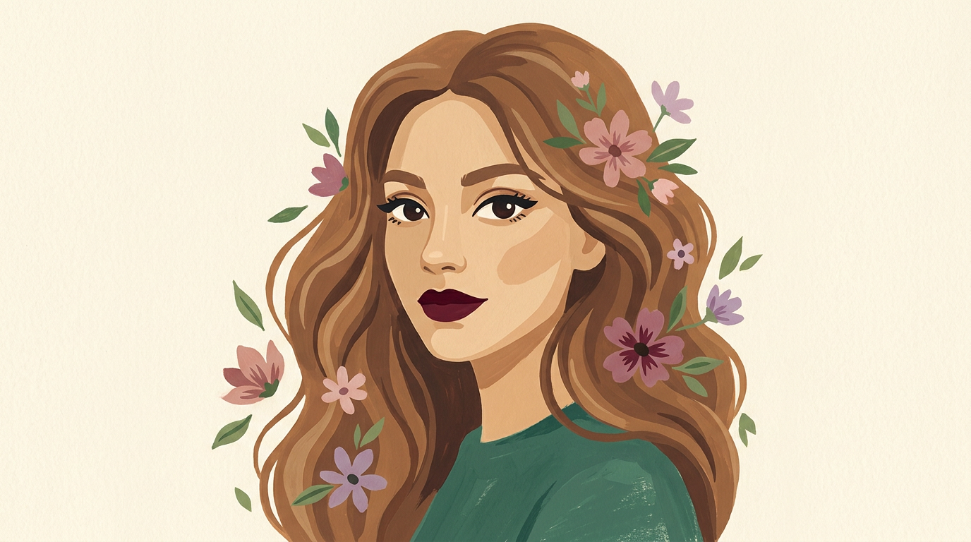
A gouache portrait of [a young woman with loose wavy hair and flowers woven
through it]. Style: contemporary flat graphic portrait — simplified planes
rather than rendered detail. Skin tones: [warm sandy mid-tones with peachy
highlights and warm umber shadows] — warm lights, cooler shadow planes,
transitions as flat color steps not gradients. Features: [simplified graphic
features with expressive eyes as focal point] — eyes as focal point, lips as
strong graphic shape. Hair: [warm brown with flat gestural brush marks
suggesting flowing movement]. Background: flat wash of [warm cream] — simple,
not competing. Florals: [small dusty pink and lavender flowers around the head]
in the same flat gouache style. Technique: opaque gouache layers — lights
applied over darks last, titanium white marks for final highlights. Mood:
[serene and softly contemplative]. No watercolor transparency, no blended
gradients — graphic flat gouache quality.
Variables to customize:
- Subject:
a man with expressive eyes, strong brow/a child with wide curious eyes/an older woman with silver hair - Background:
deep navy blue/dusty lavender/warm terracotta - Mood:
joyful and bright/mysterious and cool/powerful and direct
Skin tones in gouache: The phrase "transitions as flat color steps not gradients" is key. Authentic gouache portrait technique places skin tones as discrete planes — a warm light plane, a mid-tone plane, a cool shadow plane — not blended smoothly. This graphic quality is what separates gouache portrait illustration from oil painting or digital rendering.
4. Fantasy Character in Gouache
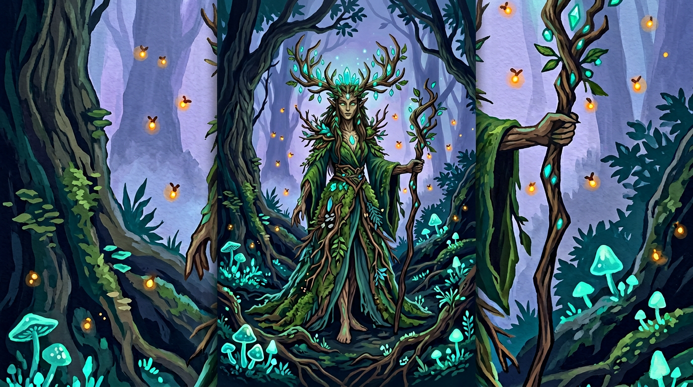
A gouache fantasy illustration of [an ethereal forest spirit with antlers and
flowing robes woven from leaves] in [a twilight forest with glowing mushrooms
and fireflies]. Character: [tall and willowy with luminous pale skin and deep
green eyes]. Costume: [flowing robes made of living leaves and moss, interwoven
with glowing vines]. Magical elements: [fireflies and glowing teal mushrooms
at her feet, amber firefly lights drifting upward] — glowing effects achieved
through warm opaque gouache over dark base layers. Background: [deep forest
with misty atmosphere in midnight blue and deep teal] rendered with flat color
planes. Lighting: [cool lavender ambient light with warm amber firefly glows] —
light sources painted as flat warm shapes over dark gouache. Color scheme:
[midnight blue, deep forest green, teal, warm amber glow, soft lavender mist].
Style: fantasy book cover gouache illustration — richly colored, graphic depth.
Technical: dark ground first, mid-tones layered, lights and magic glow added
last as opaque marks. No digital gradients — pure gouache opacity and layering.
Variables to customize:
- Character:
a sea witch with coral and kelp/a fire mage with ember trails/a sky guardian with cloud wings - Environment:
underwater kingdom in deep ocean blues/stormy mountain peak/ancient stone temple ruins - Palette:
jewel tones with golden light accents/warm ember reds and deep charcoal/cool arctic blues and white
Glow effects in gouache: The instruction "warm opaque marks over dark base layers" describes how gouache actually achieves luminosity in dark scenes. Unlike watercolor (which relies on transparent glazing) or digital art (which uses blend modes), gouache creates glow by adding thick warm opaque paint over the dark ground — the visual result looks similar but the physics are different. Specifying this process produces more authentic-looking results.
5. Abstract Color Study in Gouache
An abstract gouache painting exploring [a warm-cool dialogue between coral orange
and deep cobalt blue with cream accents]. Composition: [large overlapping geometric
shapes with irregular organic edges]. Color interaction: [strong complementary
contrast with neutrals bridging the gap] — gouache's opacity allows [layering
thick opaque color planes over and around each other] without earlier layers
showing through. Marks: [large flat brush strokes with visible edges and
occasional gestural sweeps]. Surface: the characteristic matte chalky finish of
high-pigment gouache — colors appear slightly lighter and more matte than when wet.
White: [titanium white used as a graphic element — flat shapes and edge highlights].
Mood: [bold and energetic with underlying calm]. Influences: [mid-century geometric
abstraction and contemporary flat design aesthetics]. No watercolor washes, no
blended gradients, no transparency — pure flat covering power of gouache.
Variables to customize:
- Color theme:
warm sunset duet of coral and deep burgundy/cool Nordic palette of slate and ice blue/earthy terracotta and sage - Composition:
overlapping rectangles, grid-like/organic biomorphic shapes/bold diagonal bands - Mood:
calm and meditative/playful and bright/somber and rich
Why gouache for abstraction: Gouache's reworkability — the ability to paint over mistakes entirely — makes it forgiving for abstract composition. The instruction "gouache's opacity allows layering without earlier layers showing through" is technically accurate and signals to AI tools to render color relationships as graphic opaque fields, not transparent overlaps.
Gouache-Specific Prompt Tips
The Three Phrases That Define Gouache
Include these in any gouache prompt to lock in the medium's character:
- "Opaque flat gouache layers — matte chalky finish, no transparency" — establishes the fundamental visual quality
- "Lights applied last as pure opaque titanium white marks" — describes the actual painting sequence and produces the correct surface quality
- "No watercolor washes, no digital gradients" — steers AI tools away from the two most common failure modes
Describing the Layering Order
Gouache is unique in that you can work both dark-over-light and light-over-dark. In prompts:
- For botanical and portrait work: "dark background planes painted first, mid-tones over, white highlights last"
- For fantasy and poster work: "dark ground established first, subject built up in mid-tones, glow and highlights as final opaque marks"
- For abstract work: "thick opaque layers built up over and around each other — earlier colors fully covered where reworked"
Graphic vs. Painterly Gouache
The medium splits into two distinct aesthetics, and your prompts should specify which:
Graphic gouache (poster art, illustration, character design):
"Bold flat color planes, graphic simplified shadows, mid-century poster quality"
Painterly gouache (plein air, portrait, still life):
"Visible brush marks, gestural marks, color planes slightly varying within each shape"
What NOT to Ask For in a Gouache Prompt
- Wet-on-wet blooms — that's watercolor. Gouache doesn't bloom.
- Preserved white paper highlights — gouache uses opaque white paint, not bare paper.
- Transparent glazes — gouache is opaque, glazing is an oil painting technique.
- Smooth digital gradients — the flat matte surface is the point.
Related Resources
- ChatGPT Watercolor Prompts — Compare gouache and watercolor approaches
- ChatGPT Oil Painting Prompts — Oil painting's layering approach vs. gouache
- Fantasy Art Prompts — Apply gouache style to fantasy subjects
- Fashion Illustration Prompts — Gouache's graphic quality suits fashion illustration
Conclusion
Gouache prompts succeed when they capture the medium's defining quality: full opacity, matte surface, and the ability to build up graphic color fields in a way no other painting medium can match. The five templates here cover gouache's strongest use cases — from tight botanical illustration to loose poster street scenes, from flat graphic portraits to richly layered fantasy characters.
The key phrase to remember: gouache covers completely. Unlike watercolor (which is about what you leave), gouache is about what you put there — flat, opaque, and exactly the color you chose. Let your prompts reflect that direct, confident, covering quality.